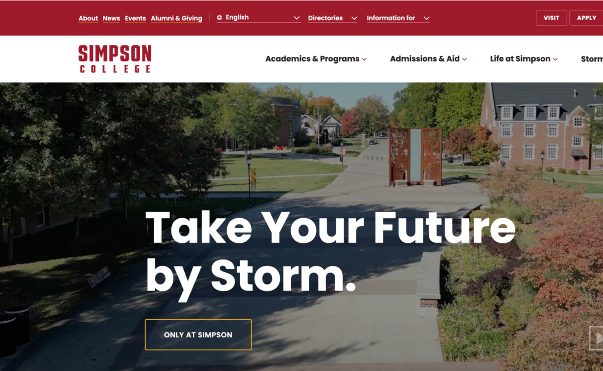
Simpson College has recently launched a redesigned and updated website. The change aims to improve accessibility and better showcase campus life, academic offerings and resources. The new website provides better graphics and a more engaging experience for current students, staff, faculty, alums and prospective students.
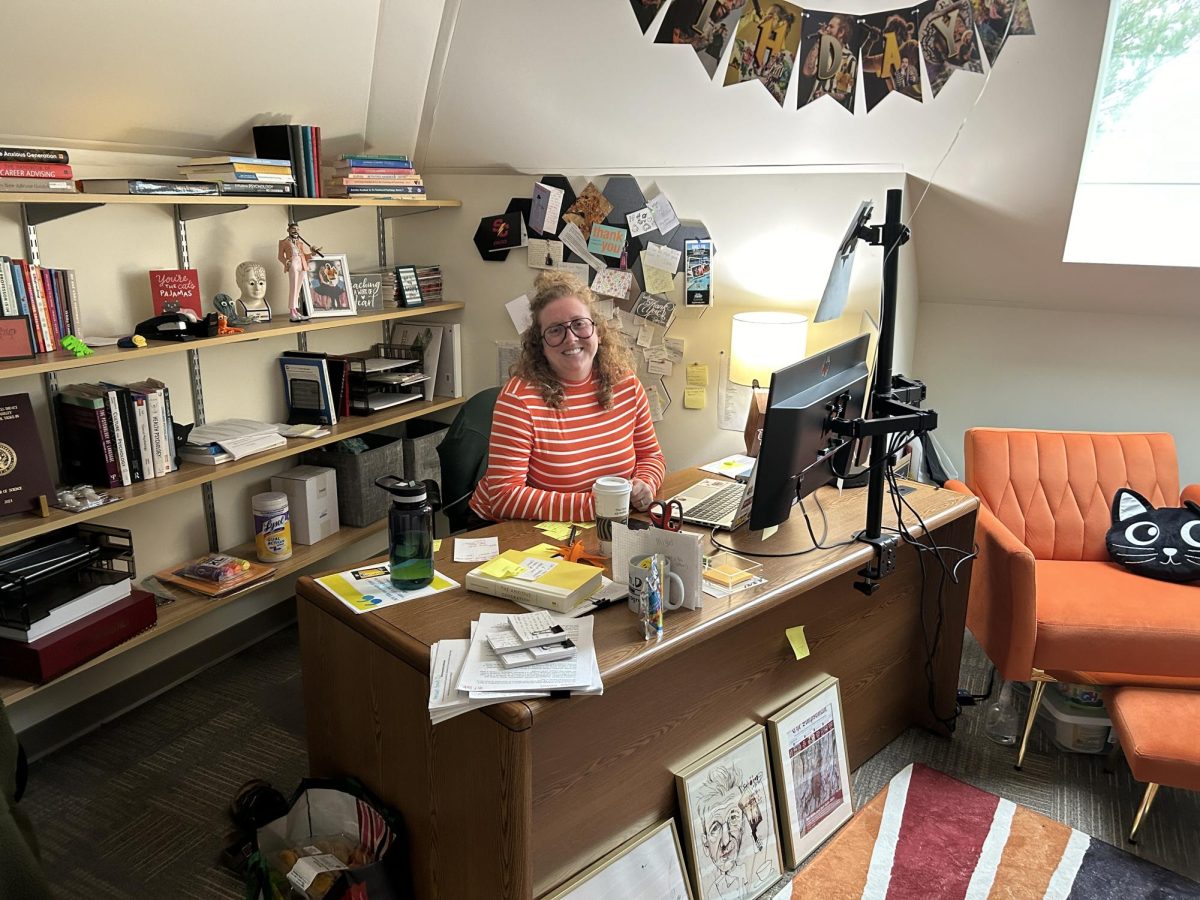
With the new website, Simpson College hopes to benefit the Simpson community with an engaging presentation of the educational experience and the Simpson story.”I am in favor of the new design. It’s crucial for organizations to constantly evaluate their website to ensure its content is fresh and engaging for all its users,” Lisa Carponelli, professor of multimedia communication said.
The main focus of the redesign was to engage prospective students and meet the needs of the current Simpson community.
“We hope to draw prospective students into our story, enticing them to visit campus and learn more about what a great fit we might be for their educational aspirations,” Roger Degerman, vice president of marketing and strategic communications said. “At the same time, it is obviously important that the site serves our current students, faculty and staff well in providing ease of access to vital information related to their academic pursuits and co-curricular interests.”
The process of creating and launching the new website took 14 months. The college partnered with OHO Interactive to implement this process.
“From there, we went through the arduous process of content strategy development, information architecture, visual design concepts review and testing with focus groups, technical development, quality assurance, and, ultimately, deployment of the new site,” Degerman said.
Launching any website comes with challenges and roadblocks, as well as balancing functionality with a pleasing aesthetic, meeting consumer needs and ensuring the website is responsive across different platforms.
“Prior, during and post-launch, our team has met daily to proactively address and respond to issues—some of which we identify and others that are brought to our attention. We’ve made tremendous progress in fixing bugs, but there is still work to do, including with strengthening our search function,” Degerman said.
The college hopes to facilitate more user-generated content, testimonies of students and alums, cybersecurity and soon, staff and faculty will be able to edit content to keep their information up to date.
“I’m biased, but I like the video elements. I also know that will require frequent and consistent updates as we go through the school year and into the summer. We will constantly need fresh content,” Carponelli said.
It has been 6 years since the Simpson website has been updated. The previous website had become muddled, the information was outdated and the navigation was challenging.
“During this project, we have worked with almost all (if not all) departments that touch current students,” Degerman said. “We’ve helped organize and build out mental health resources, financial aid information, student club options, program details, internship information, literally any office you can think of we have worked with to update and better organize their information to better serve current students.”
The changes have largely been well-received by students.
“I’m so glad we got a new website because of how outdated the old one was, and this one fits the more 2024 modern theme of the internet way better. Overall, I’m so glad they finally did a revamp, and I can’t wait for the future,” Junior Brady Siders said.
“We are super proud of our new website—and my colleagues in OMSC, who have worked diligently above and beyond their normal responsibilities to get this site rolling and to address all issues that surface,” Degerman said.


